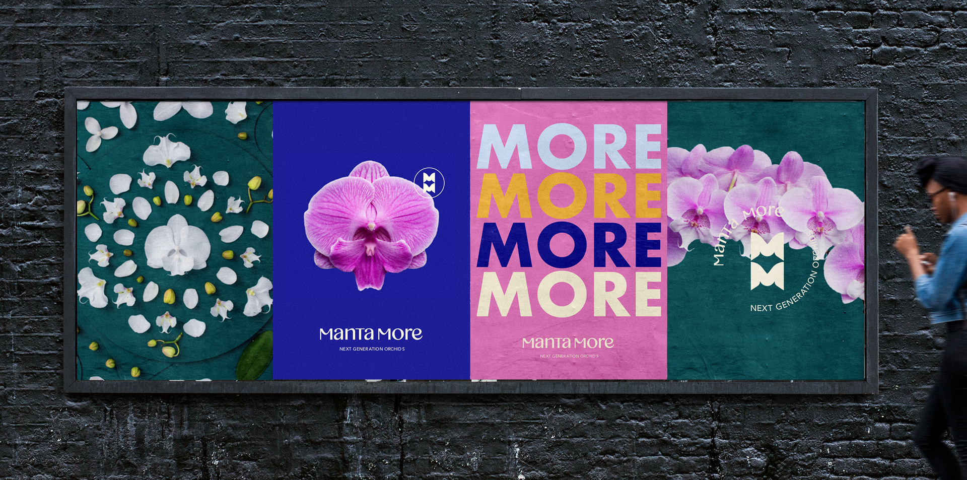
MANTA MORE | BRAND IDENTITY
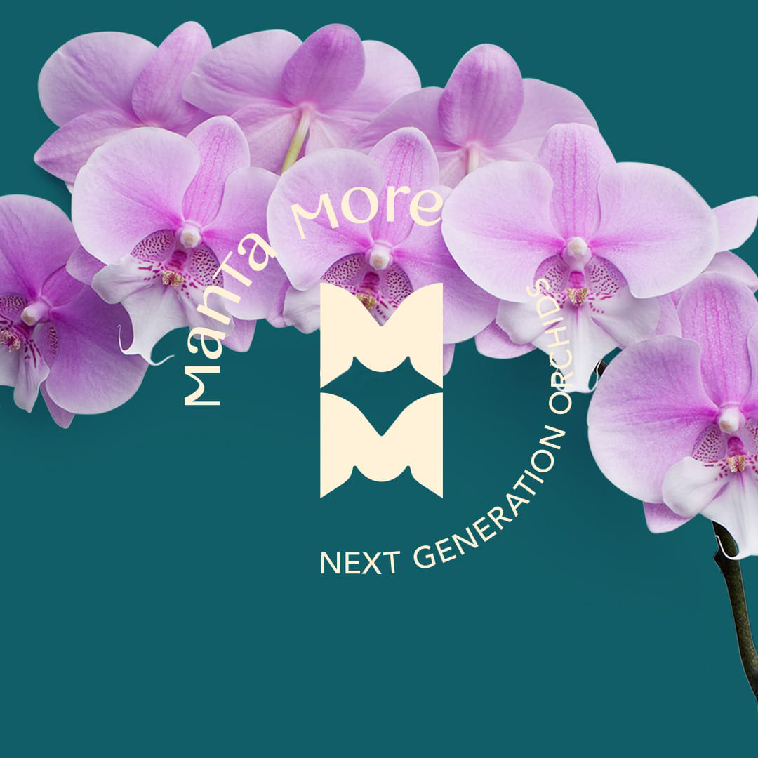
In 2019, I was commissioned to create the visual identity of the ‘Next Generation’ orchid. Manta More is an impressive new breed of orchids characterized by a large lip (lower petal), which makes the appearance of the orchids more striking, more open and confident.
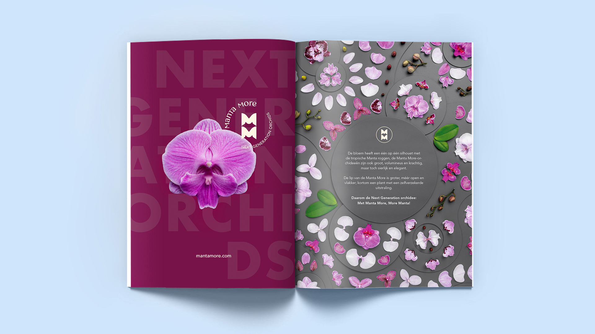
This variety of orchids has a unique silhouette that evokes the graceful Manta rays. Like these tropical animals, Manta More orchids are large, voluminous and powerful, yet graceful and elegant. The design of the logo mark and the whole appearance of the visual identity was informed by this resemblance.
Designed at Narwal Creative.
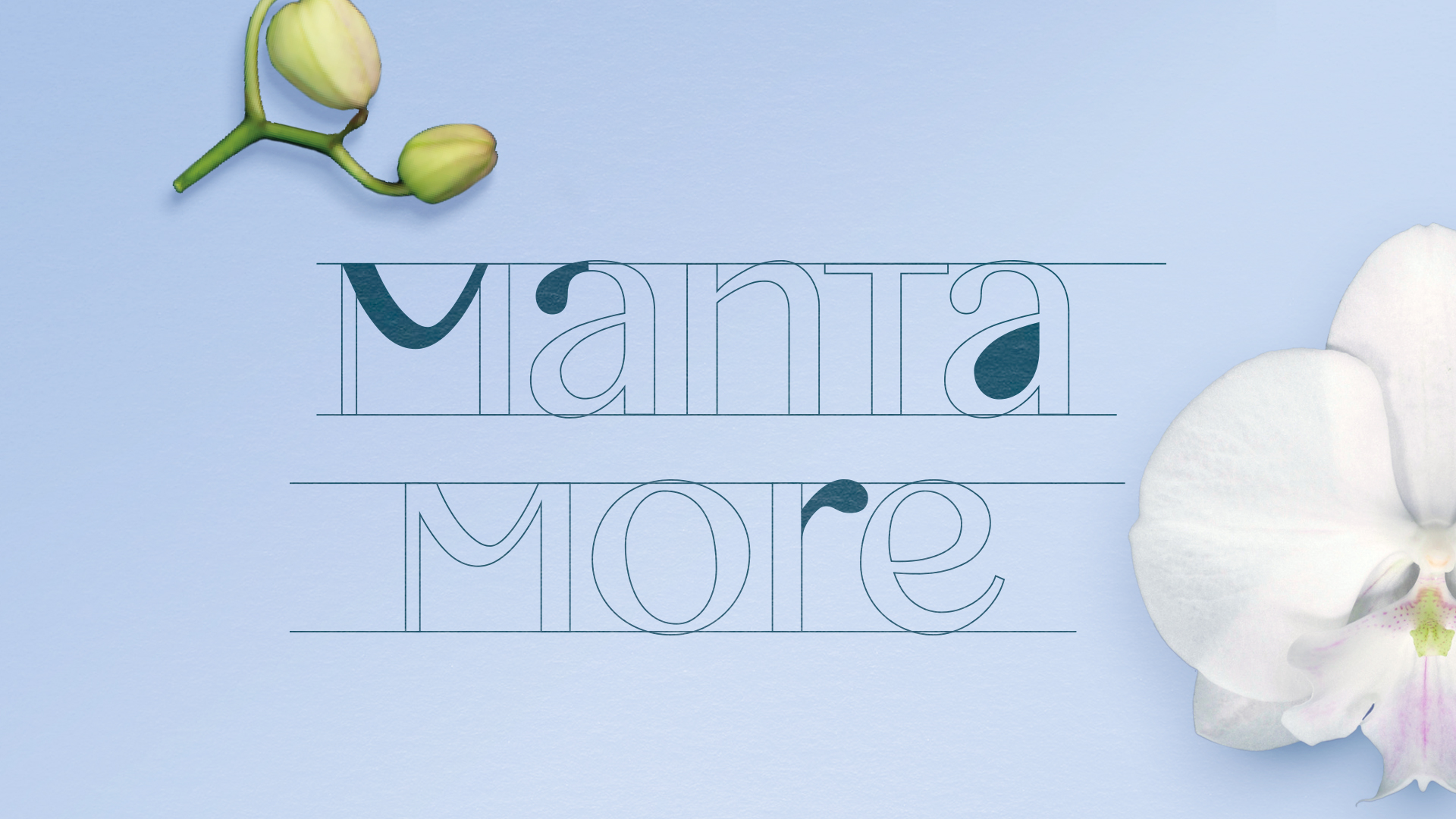
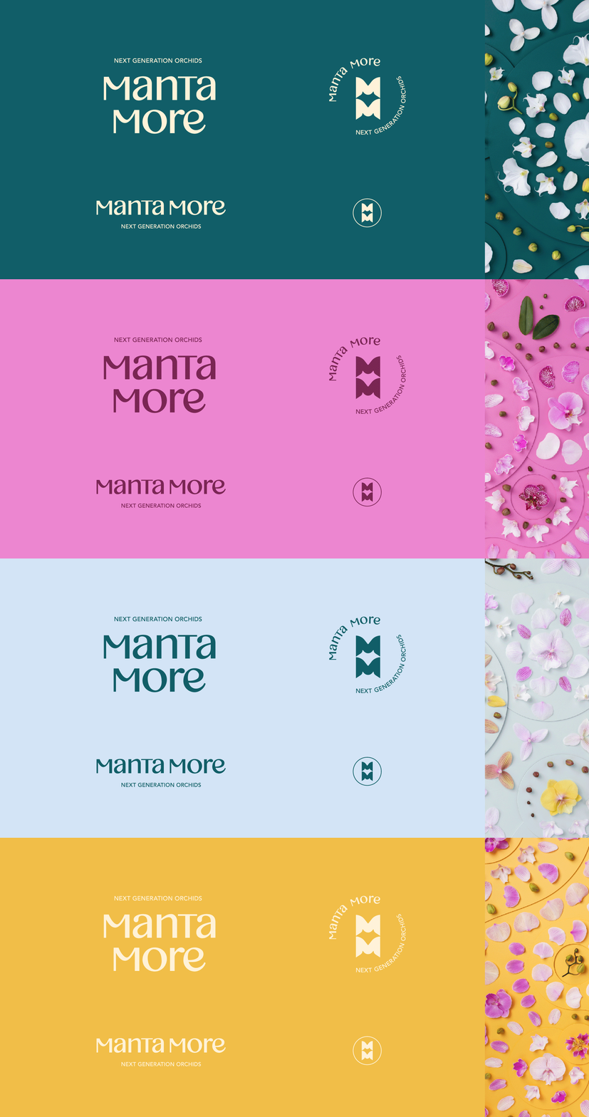
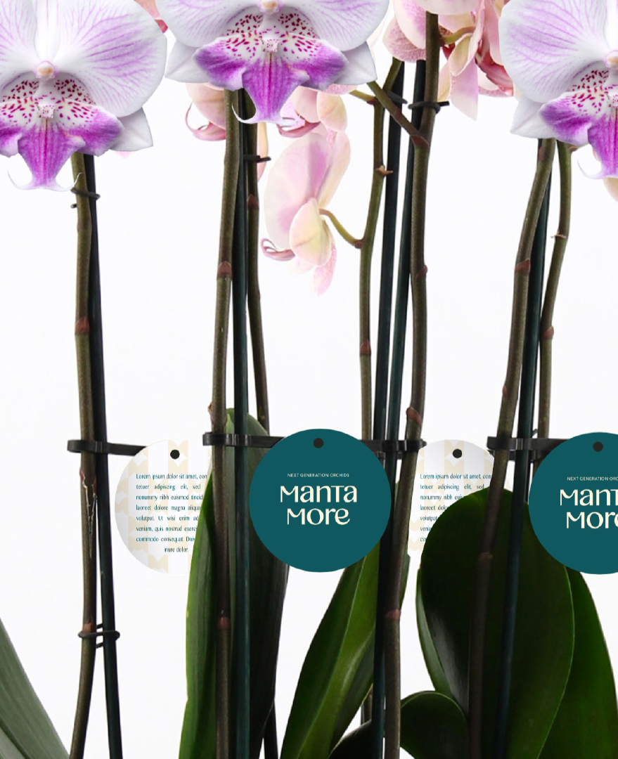

To reveal the exotic personality of the plants and tell their exciting brand story, I designed a dynamic system of distinctive brand elements and carefully selected vibrant color ways that truly brought to life the new visual identity.
© Boyko Taskov 2023
